
Mobilizing on the Right to Housing
with the Women’s National Housing and Homelessness Network
The Women’s National Housing and Homelessness Network is a collective of diverse women, including those with lived expertise, who are working to eliminate homelessness and housing insecurity for women, girls, and gender-diverse peoples across Canada.
Sector:
Housing Justice
Services:
Editorial Design
Graphic Design
Illustration
Branding
Learn More:
Visit the toolkit website
The Women’s National Housing and Homelessness Network (WNHHN) filed two claims to call attention to Canada’s failure to address the homelessness crisis. This resulted in a review panel, Neha, to examine the right to safe, adequate and affordable housing for women, Two Spirit, Trans and gender-diverse people, including the government’s duty to uphold this right. As part of this project WNHHN created a toolkit for communities connect to lived experts, gather evidence and engage in the process.
Anti-Heroine Media joined the project to ensure that the toolkit design met the following goals:
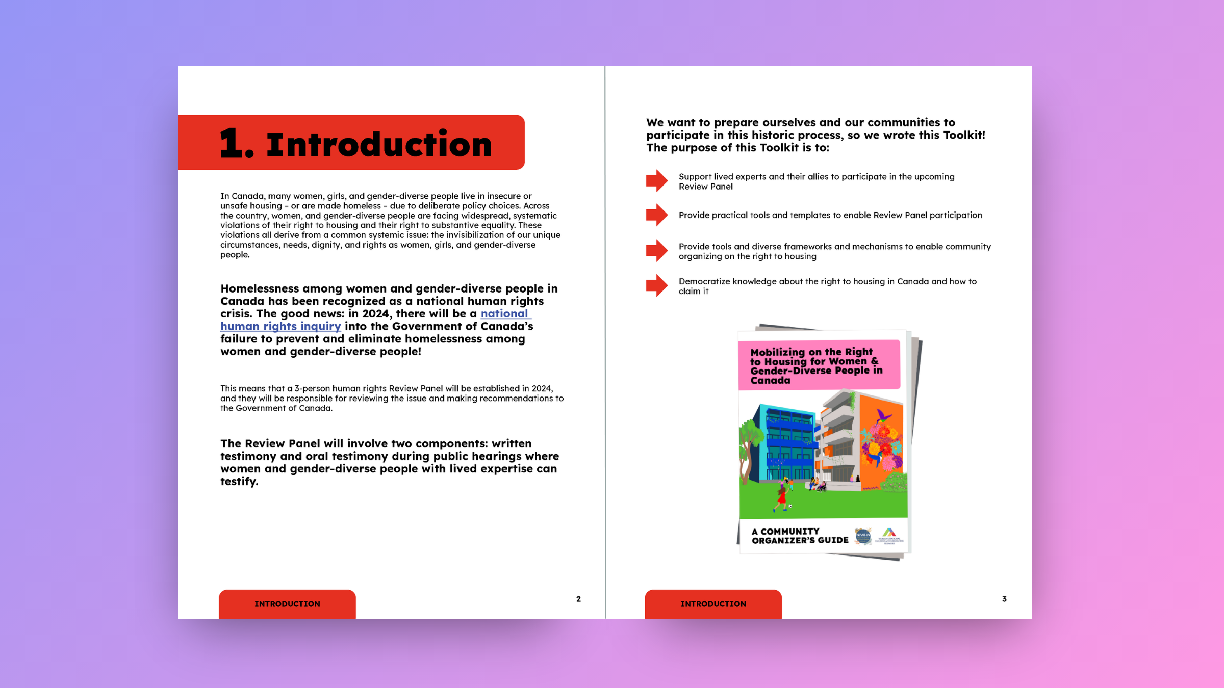
Provide practical tools and templates to enable Review Panel participation
Provide tools, frameworks and mechanisms to enable community organizing on the right to housing
Democratize knowledge about the right to housing in Canada and how to claim it
We created a distinct brand identity for this project, with a palette of bright and bold eye-catching colours to use throughout the design. These colours reflect common shades used in protest movements around the world, and take inspiration from the Progress Pride and Disability Justice flags.
The eight colours in the palette correspond with the eight parts of the toolkit. This makes the document easier to navigate and access specific resources. We chose the Lexend font because it is specifically designed with accessibility in mind, while being clean and graphic to balance out the punchy colour palette.

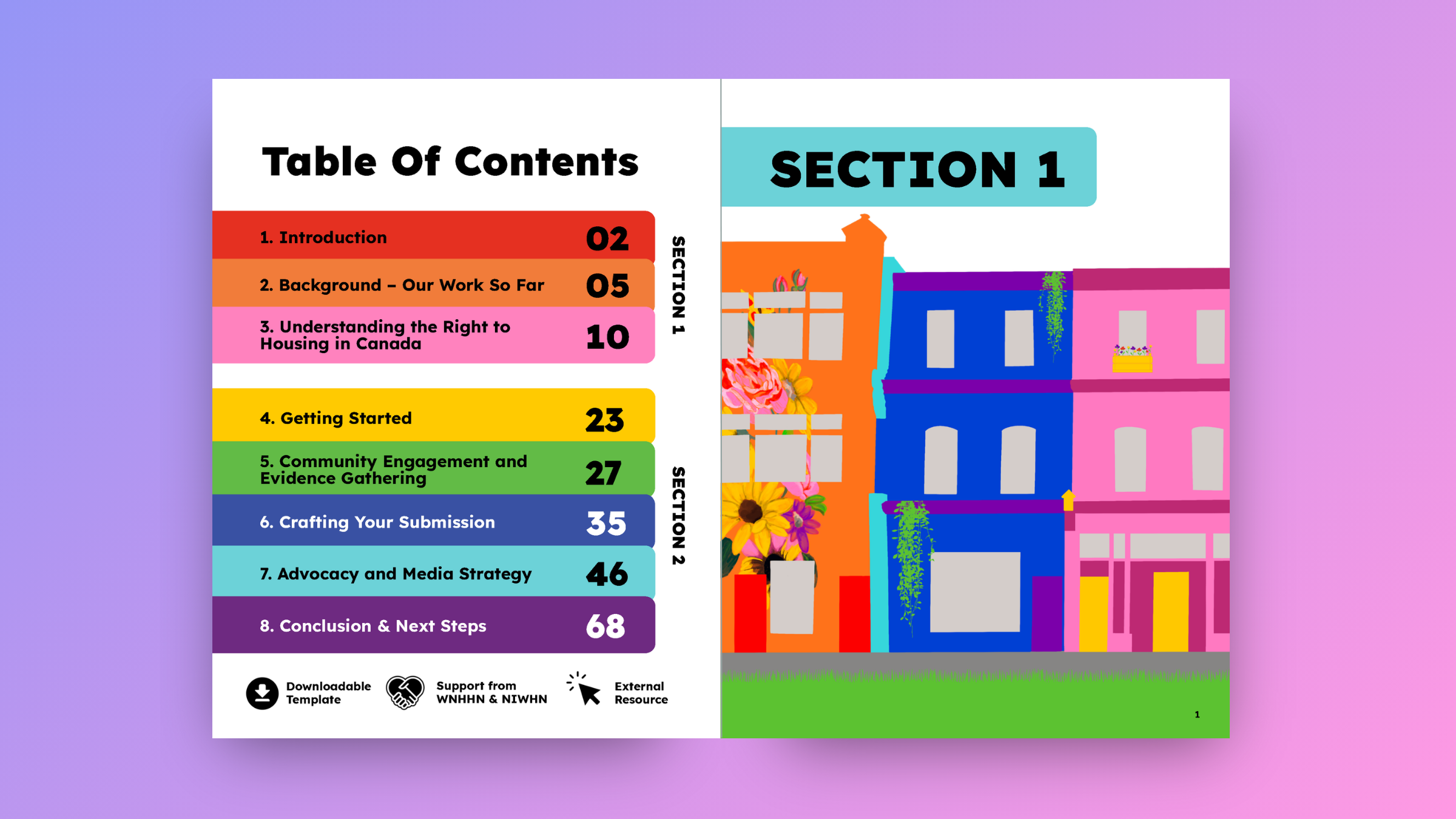

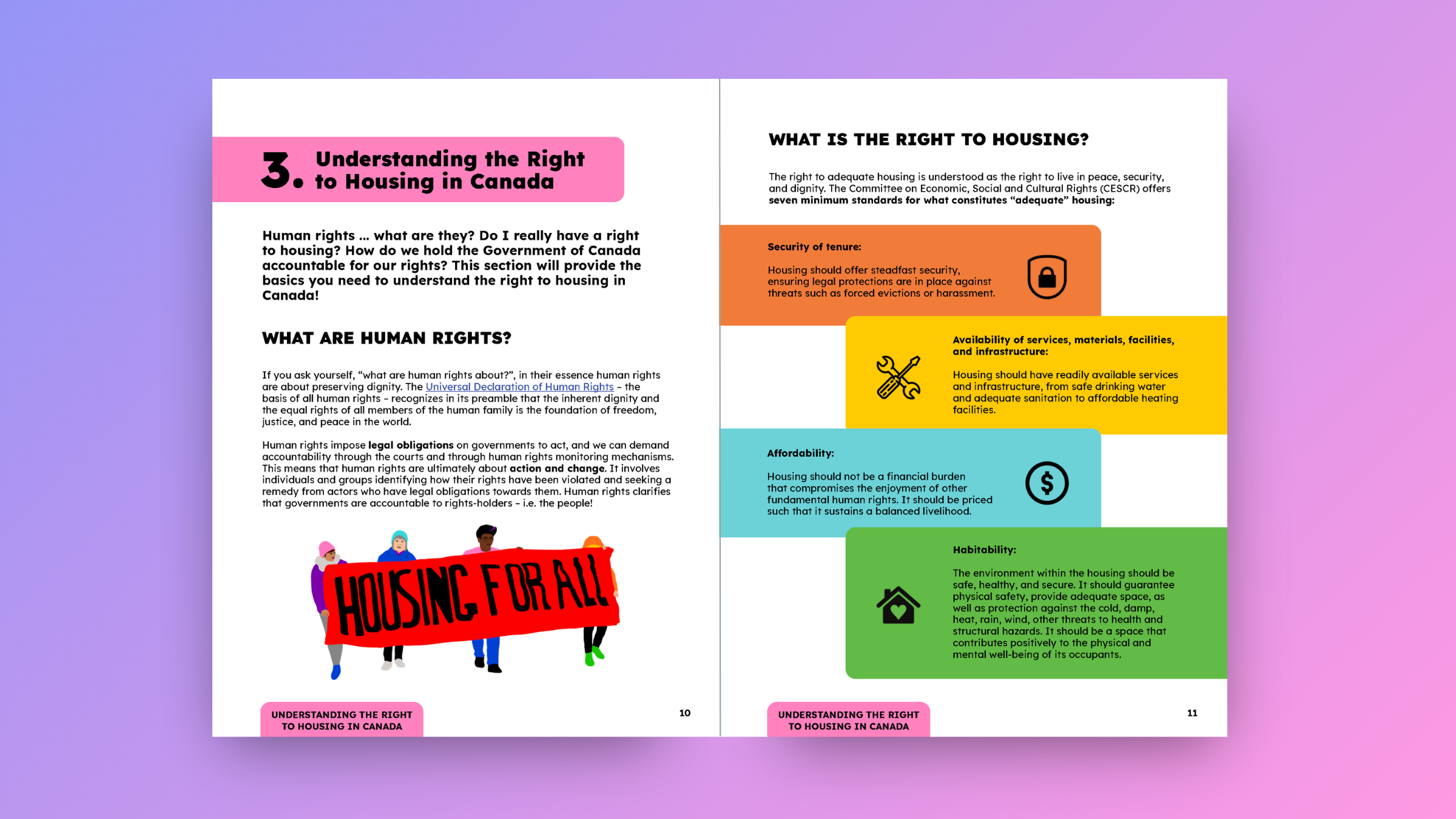
We wanted to ensure that the toolkit was easy to read, while also highlighting the vibrant communities who would be using it. The resulting design is filled with lots of high impact original illustrations to break up the text and show the resources in action. The illustration style takes inspiration from pop and street artists, who have long used the form to challenge the status quo. This links directly to the issue of housing, especially in urban spaces, and community collaboration for change.
It was especially important for us to illustrate different examples of what housing can look like across the country. Plants and nature imagery are tied into the depictions to symbolize that housing is a natural human right, something that should be guaranteed to everyone.